
So, I made $88.71 for each person who visited this one single page on my website.
What page was it?
My checkout page.
Here’s a screenshot of what it looks like:
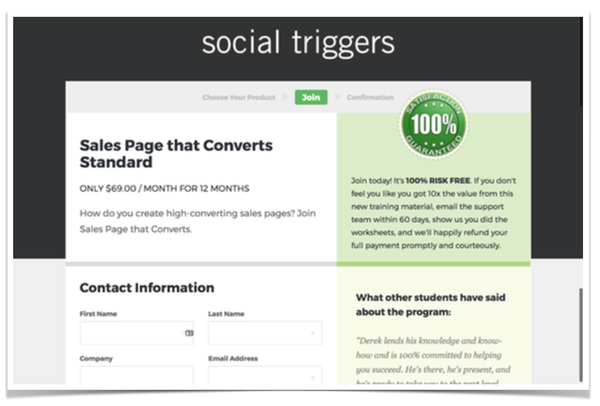
It’s simple.
It’s clean.
And it works like a charm.
Now let me breakdown why it works…
And then show you how to make one yourself.
The “Human Psychology” Behind A Checkout Page That Converts
Your checkout page is the page people visit to “make an order.” It’s where they enter their name, their email, their address, and of course, their payment information.
What’s going on inside their mind?
Well…
I’ve talked about this before, but people hate spending money because spending money HURTS. Literally. When people spend money the pain center of their brain lights up.
So, they’re going to try and talk themselves out of spending money simply to avoid the pain of spending. All sorts of things will pop into their head, too.
“Do I really need this?”
“What if it’s not what I expected it to be?”
“Is this really worth it?”
And I can totally relate.
Even though buying something online is more common place now than ever before, it’s still a pain in the ass. And there’s always that nagging thought, “what if this ends up being a pain in the ass.”
And that’s where your checkout page comes into play.
Your checkout page should help alleviate all of these concerns. It should make people feel comfortable. It should make people feel confident they are making the right purchase. It should make people WANT to finish the sale.
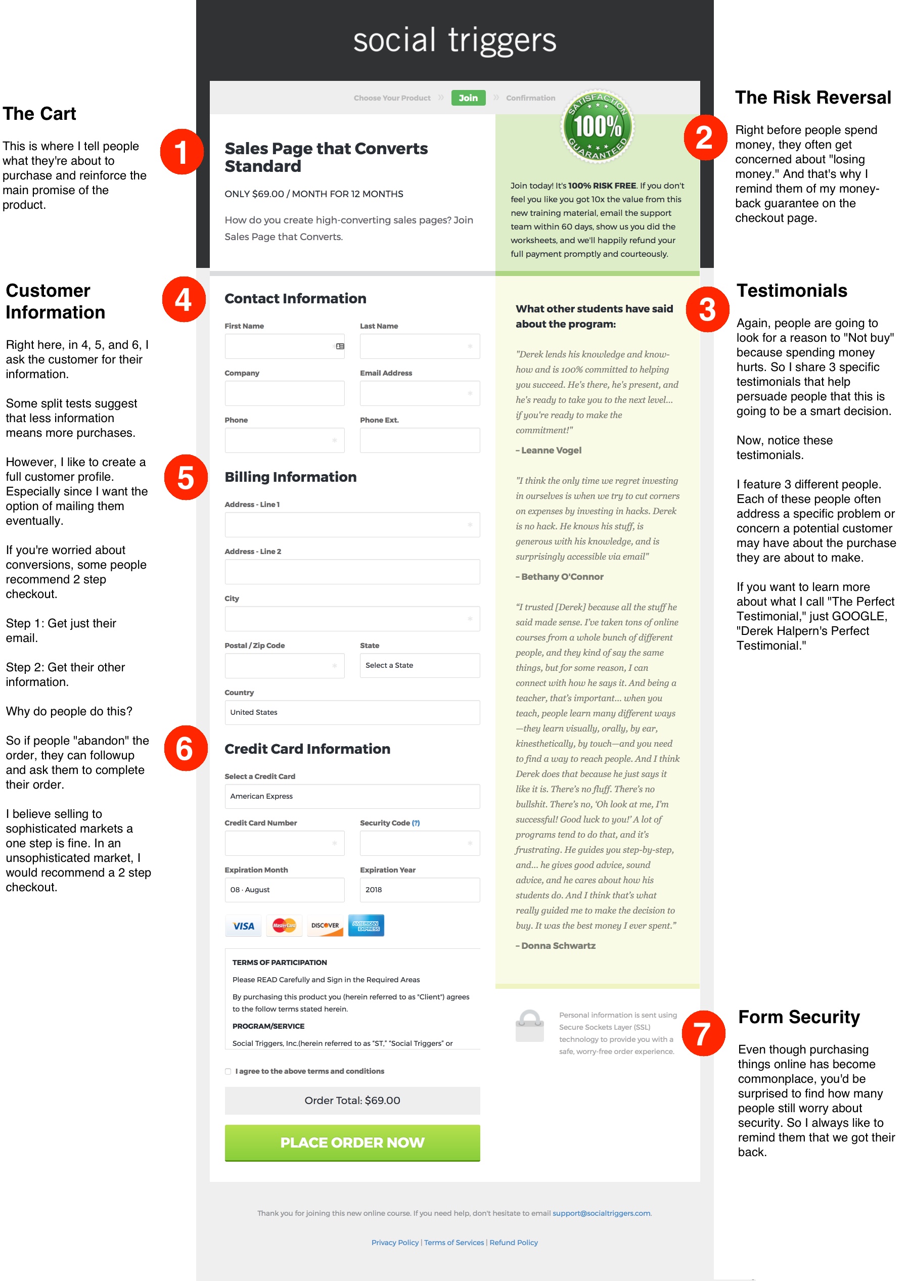
Now take a look at this checkout page once more.
This time I annotated it for you.
Additionally…
Right below this big image, I’ll show you how you can create a high-converting checkout page with ease.
Now that you know you want to make a better checkout page, I want to show you a piece of software that makes it very easy.
It’s called Sam Cart. And their default template looks almost identical to this template I use. The difference?
I spent thousands of dollars getting my template custom coded.
But you can Try Sam Cart for just $19 per month.
It’s pretty crazy.
You can see how it all works right here.
And please note…
Yes. That’s an affiliate link. Which means I’ll get a commission if you buy Sam Cart. It’s small though. In the end, I don’t care if you use Sam Cart or hire an expensive developer like I did. I just wanted to create a simple post walking you through why I created my checkout page the way I did.
Now…
If reading the image was difficult, I’ll go over the key points right here.
#1 The Cart
Remind people what they’re about to purchase. Additionally, it’s smart to reinforce one of the CORE Promises of the product.
In the screenshot, I’m selling my course “Sales Page that Converts.” And as you can see, I tell them what they’re about to purcahse, and I mention the main benefit: “How do you create high-converting sales pages? Join Sales Page that Converts.”
#2. The Risk Reversal
Spending money hurts, and that’s why it’s important to feature your money-back guarantee. This helps show people what to expect, and that there really is no risk to making this purchase right now.
#3. The Perfect Testimonial
Again, spending money hurts. And people want to find a reason why they shouldn’t spend it. So, I always feature testimonials that reinforce some of the main benefits. I also like to feature testimonials that answer some more obvious objections to purchasing.
Just remember
If they’re on the checkout page, they’re already interested in buying the product. So, short, hard-hitting testimonials work best.
For more information about that, I created a video called “The Perfect Testimonial.” I suggest you watch it.
#4, #5, #6 – Customer Information
As you can see in the graphic, 4, 5, 6 is where I ask the customer for their information. Some split tests suggest that less information converts better…
However, I like to create a full customer profile. I want their name. I want their mailing address. I want everything. Even if it lowers conversions.
Why?
I want the option of mailing my customers. Also, I want the ability to potentially spot fraud. If I offered just credit card information and that’s it… I’m certain fraud would go up.
That said…
I believe selling to a sophisticated market is a little bit easier than selling to an unsophisticated one. And that’s why I use one step. However, if you’re selling to an unsophisticated market, you may want to try “two steps.”
Here’s how it works:
Step 1: You ask for their name and email.
Step 2: You ask for more detailed customer information and payment information.
Why?
This allows you to get the name so you can followup on abandoned carts.
#7 – The Security Reminder
Even though people are comfortable with making purchases online, some people are still concerned about their data and information. And that’s why I like to remind them that their order is secure.
I’m not sure if it increases conversions or not, especially in my market. However, again, in an unsophisticated market I believe things would change drastically.
Now I pass it to you…
What do you think is vital on a checkout page? Leave a comment.
And remember…
Right now Sam Cart has a special deal where you can use their “Drag and Drop” software to create checkout pages… FAST.
And it’s just $19 per month.
You can see how it all works right here.
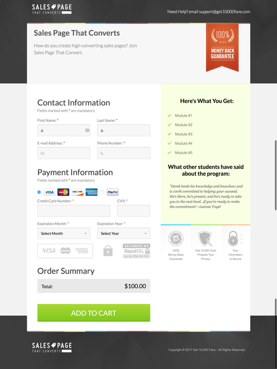
And you can make a checkout page that looks just like mine in just a few seconds. Take a look at what Brian created in less than a few minutes:
And please note…
Yes. That’s an affiliate link. Which means I’ll get a commission if you buy Sam Cart. It’s small though. In the end, I don’t care if you use Sam Cart or hire an expensive developer like I did. I just wanted to create a simple post walking you through why I created my checkout page the way I did.
Now leave a comment.